I Tested Napkin AI: Can It Really Turn Plain Text Into Visuals?
Creating a useful visual from a block of text usually takes more than just writing the content. You need to think about layout, hierarchy, illustrations, spacing, and how to present the information. I wanted to see what would happen if I gave Napkin AI a normal piece of written content and let it handle the…
Creating a useful visual from a block of text usually takes more than just writing the content. You need to think about layout, hierarchy, illustrations, spacing, and how to present the information.
I wanted to see what would happen if I gave Napkin AI a normal piece of written content and let it handle the visual design for me. So I opened Napkin AI, chose Visuals, and used a short article about the evolution of artificial intelligence as my test.
Instead of simply looking at its features or reading what other people say about it, I gave it a real piece of content and checked what kind of visual it could create from my text.
For this test, I used a short explanation about the evolution of artificial intelligence.
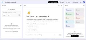
Napkin AI’s starting screen, with options to create visuals or build presentations.
My goal was simple:
Can Napkin AI take ordinary written content and turn it into a useful visual without me manually designing the entire thing?
I wanted to see:
How easily I could provide my content
How Napkin AI interpreted the information
What kind of visual structure it created
Whether the generated visual matched my original text
Whether the result was actually useful for an article or presentation
How much manual editing might still be required?
This wasn’t a theoretical review. I actually used the tool and evaluated the output it generated.
The Content I Used for the Test
For my test, I used a short piece titled “The Evolution of Artificial Intelligence.” I wanted something simple enough to evaluate visually but detailed enough to give Napkin AI multiple ideas to work with.
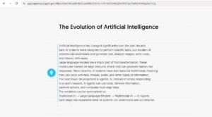
The title and text I used as my test input in Napkin AI.
The Evolution of Artificial Intelligence
My test content explained how AI has developed from traditional task-specific systems to large language models, multimodal AI, and AI agents.
The final part of my input summarized the evolution as:
Traditional AI → Large Language Models → Multimodal AI → AI Agents
I then entered this content into Napkin AI and generated a visual.
My test input
Artificial intelligence has changed significantly over the past decade. Early AI systems were designed to perform specific tasks, but modern AI systems can understand and generate text, analyze images, write code, and interact with users.
Large language models are a major part of this transformation. These models are trained on large amounts of text and can generate human-like responses. More recently, AI systems have also become multimodal, meaning they can work with text, images, audio, and other types of information.
The next major development is agentic AI. Instead of simply responding to a user’s request, AI agents can use tools, retrieve information, perform actions, and complete multi-step tasks.
The evolution can be summarized as:
Traditional AI → Large Language Models → Multimodal AI → AI Agents
The Result: Napkin AI Turned My Text Into a Visual
And this was the result.
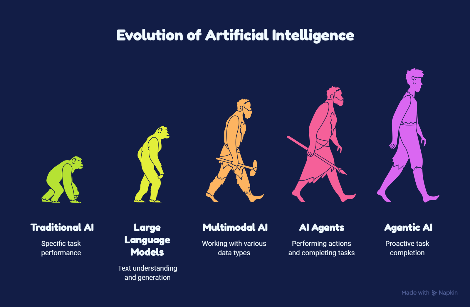
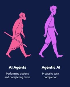
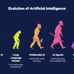
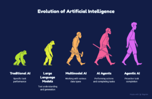
Napkin AI turned my text into a five-stage visual showing the progression from Traditional AI to newer AI systems. What caught my attention was the use of a human-evolution-style illustration rather than a basic flowchart.
At a glance, I found the visual much easier to scan than the original paragraphs.
The visual Napkin AI generated from my test content.
What I Liked About the Result
1. It Converted Text Into a Visual Concept
The biggest positive from my test was that I didn’t have to manually design an infographic from scratch.
I provided the written explanation, and Napkin AI transformed the information into a visual structure.
For someone who regularly creates blog posts, presentations, reports, or educational content, this can save a significant amount of design work.
2. The Visual Storytelling Worked
The human-evolution concept was a smart visual choice for this particular topic.
The progression naturally communicates the idea of evolution, so the visual and the subject matter work together.
Instead of using five unrelated icons, the generated illustration creates a continuous story.
That makes the concept easier to understand at a glance.
3. The Output Was More Than Just Text Boxes
Another thing I noticed was that Napkin AI didn’t simply place my paragraphs into a series of boxes.
It interpreted the subject and created a visual representation around it.
[Screenshot 4: Close-up of generated visual]
A closer look at the visual structure generated from the text.
This is important because the usefulness of a visual AI tool isn’t just about making something colorful. The visual needs to communicate the underlying idea.
In this test, the generated concept was relevant to my topic.
One Unexpected Thing I Noticed
One thing immediately stood out to me. My original summary ended with four stages, but Napkin AI’s visual contained a fifth label: Agentic AI.
I didn’t specifically structure my final summary that way, so this was a good reminder that AI-generated visuals shouldn’t be treated as automatically accurate.
The output was useful, but I still needed to compare it with my original content before considering it ready to publish.
Napkin AI introduced “Agentic AI” as an additional label in the generated visual.
My takeaway
AI can be useful for transforming information into visual form, but I wouldn’t publish the generated result blindly.
I’d always compare the final visual against the original content to make sure:
No information was added incorrectly.
No important information was removed.
Labels are accurate
The visual matches the intended message.
For my test, this was a small but important difference between my original input and the generated result.
How Much Manual Work Was Required?
For this particular experiment, the initial visual generation required very little design work from me.
However, I would still treat the generated visual as a starting point rather than a finished design.
Before publishing, I would check the wording, labels, visual accuracy, spacing, and whether the design actually fits the intended platform.
That’s especially important when the content contains technical information.
Who Could Benefit From Napkin AI?
From this test, I can see the most value for people who already have the information written but struggle with presenting it visually. If you’re exploring more AI tools that can improve your overall workflow, check out our guide to the best AI tools for productivity in 2026.
For example, bloggers can turn explanations into supporting graphics, students can visualize notes, and presentation creators can use it to turn ideas into diagrams or structured visuals.
What I Would Improve Before Publishing the Output
I wouldn’t take the generated visual and immediately upload it to my website.
I would first:
1. Check every label
Make sure the terminology matches the original content.
2. Check for AI-added information
As my test demonstrated, the generated visual can introduce an additional concept that wasn’t explicitly part of my summary.
3. Crop the interface
For a blog post, I’d use the clean visual rather than a screenshot showing the entire editor interface.
4. Check readability
Make sure the text is large enough to read on desktop and mobile.
5. Add context
The visual should support the article rather than replace the explanation.
My Test Verdict
After this experiment, I think Napkin AI’s biggest strength is turning written ideas into visual concepts quickly.
The result won’t necessarily be perfect every time, and I wouldn’t rely on AI-generated visuals without checking them.
But for a simple test like my AI evolution example, it successfully transformed a block of text into a visual that communicates the overall idea much faster than the original paragraphs alone.
ToolFluxAI Test Score
Ease of getting started
⭐⭐⭐⭐⭐
Text-to-visual concept
⭐⭐⭐⭐½
Visual storytelling
⭐⭐⭐⭐½
Time saving
⭐⭐⭐⭐⭐
Following the input exactly
⭐⭐⭐⭐
Need for manual checking
⭐⭐⭐⭐
Overall
4.5/5
Final Verdict: Would I Use Napkin AI Again?
Yes.
Based on this test, I would consider using Napkin AI when I need to quickly turn written information into an explanatory visual.
What impressed me most wasn’t that it produced a perfect infographic automatically. It was the fact that I could start with ordinary written content and quickly get a visual concept that was already structured around the topic.
However, my test also showed why human review still matters.
The generated visual introduced an additional “Agentic AI” stage that wasn’t part of my original four-stage summary. That means I’d always review an AI-generated visual before publishing it, especially when the content involves technical or educational information.
My overall rating: 4.5/5. This rating is based on this specific test, not a full evaluation of every Napkin AI feature.
For anyone who frequently thinks, “I have the content, but I need a visual to explain it,” Napkin AI is definitely worth testing.
Jms Smrity is an AI enthusiast and the creator of ToolFluxAI. She writes about AI tools, content creation software, and emerging technology to help readers make informed decisions and stay updated with the latest innovations in artificial intelligence.
I am the creator and writer behind ToolFlux AI, a platform dedicated to sharing valuable content about Artificial Intelligence, AI tools, blogging, SEO, automation, and digital productivity.